relesys' internal app
When we Relesys rebranded, we decided to use this as an opportunity not only to give our internal app a new look, but also a better UX.
summary
A complete redesign of Relesys’ internal app to align with the company’s new brand identity. Beyond updating the visuals, I used this opportunity to improve the app’s UX by identifying user pain points, restructuring content for clarity, and making key information more accessible.

challenge
The initial request was to refresh the app’s interface to match our new branding. However, usability issues quickly surfaced: critical information was often buried deep in the navigation, making everyday use inefficient.
A clear example was the employee benefits page, which was placed in a counterintuitive location that few colleagues could find at first try.
approach
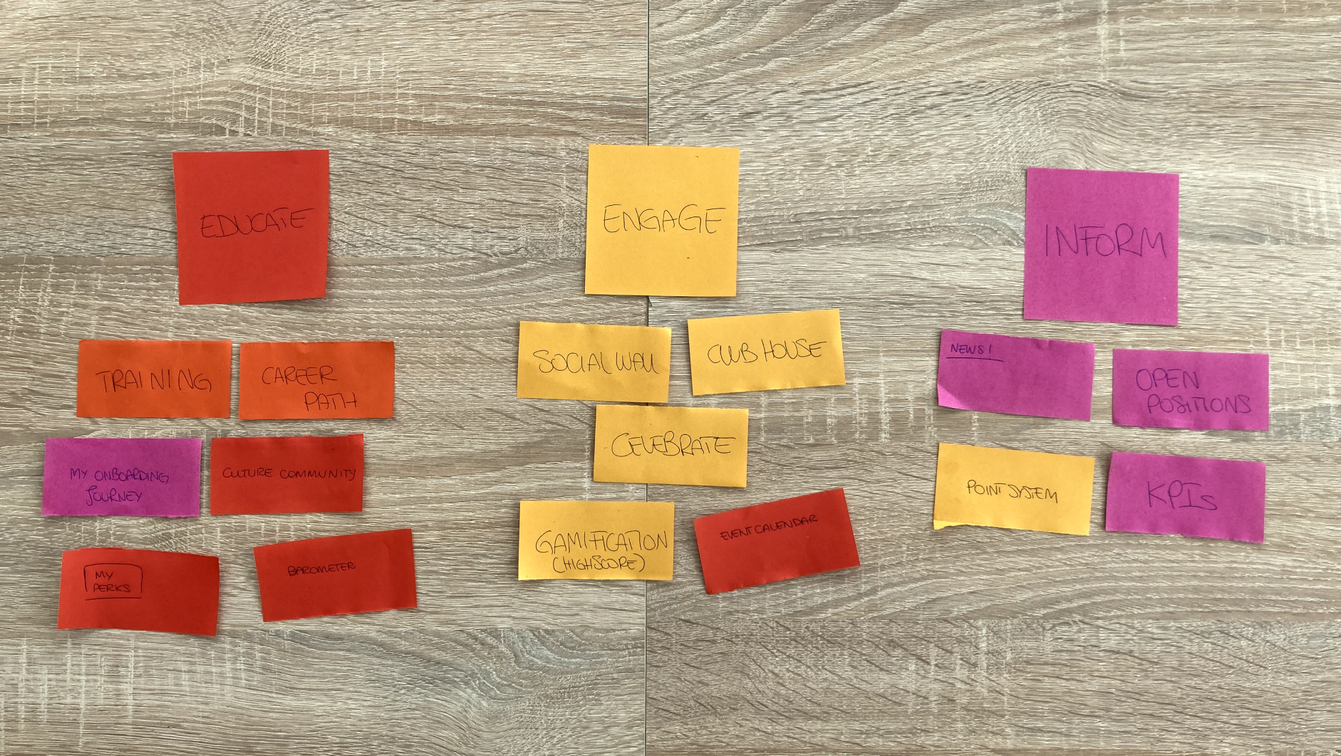
To uncover pain points systematically, I began with a short survey among colleagues to identify the most confusing areas of the app. Recurring patterns highlighted poor information architecture, so I followed up with a card-sorting exercise to reorganise features into three intuitive categories: Educate, Engage, and Inform.
During a brainstorming session, we discovered that employees tended to associate benefits with company culture. Based on this insight, I grouped benefits content under the Culture icon to make the navigation more intuitive.
I also collaborated with the Talent team to understand their content management needs, ensuring the new structure worked for both employees and administrators.
Card sorting
solution
The redesign included all key pages: homepage, landing pages, profile, and side menu. The new structure reduced the number of clicks needed to access critical content, especially employee benefits, and introduced bold, engaging visuals consistent with the updated brand identity.
Responsive design and CSS implementation ensured a smooth experience across devices.Feedback from colleagues was highly positive, especially around the ease of finding benefits and the app’s more vibrant look and feel.
Feedback from colleagues was highly positive, especially around the ease of finding benefits and the app’s more vibrant look and feel.

Wireframes
.png)
Information organisation after card sorting
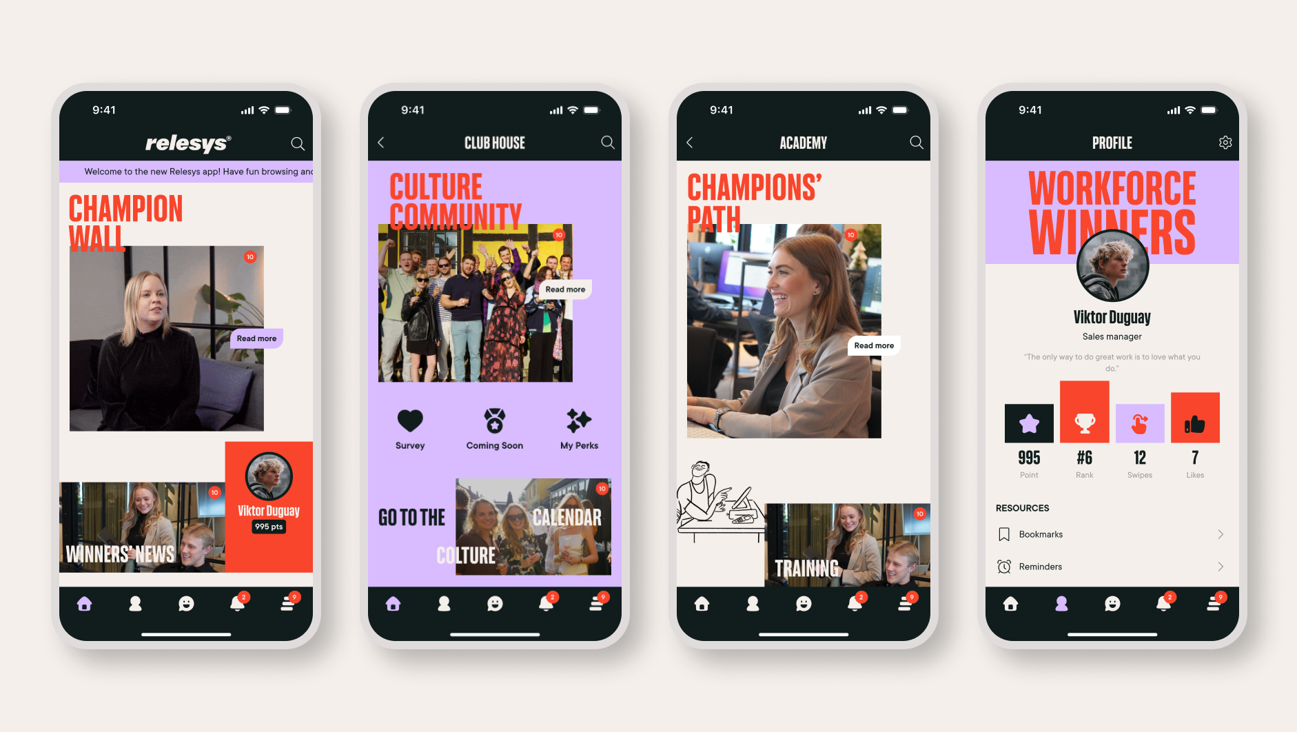
Final redesign

Redesign before and after
design testing and first results
Following the launch, I conducted brief usability interviews with colleagues to validate the redesign. I asked participants to complete a key task: “Book a massage session (one of our employee benefits) starting from the homepage.”
Out of 10 colleagues:
- 8 succeeded immediately (within minimum number of steps required).
- 2 required minimal prompting but still completed the task successfully.
This represented a major improvement compared to the pre-redesign experience, where most employees struggled to locate the benefits page.